

This is what your weekly report looks like
Every Monday you receive a plain-English summary of your website's health. You can also generate a report at any time and have it sent straight to your email. And if you ever want to explore further, the full dashboard is always available.
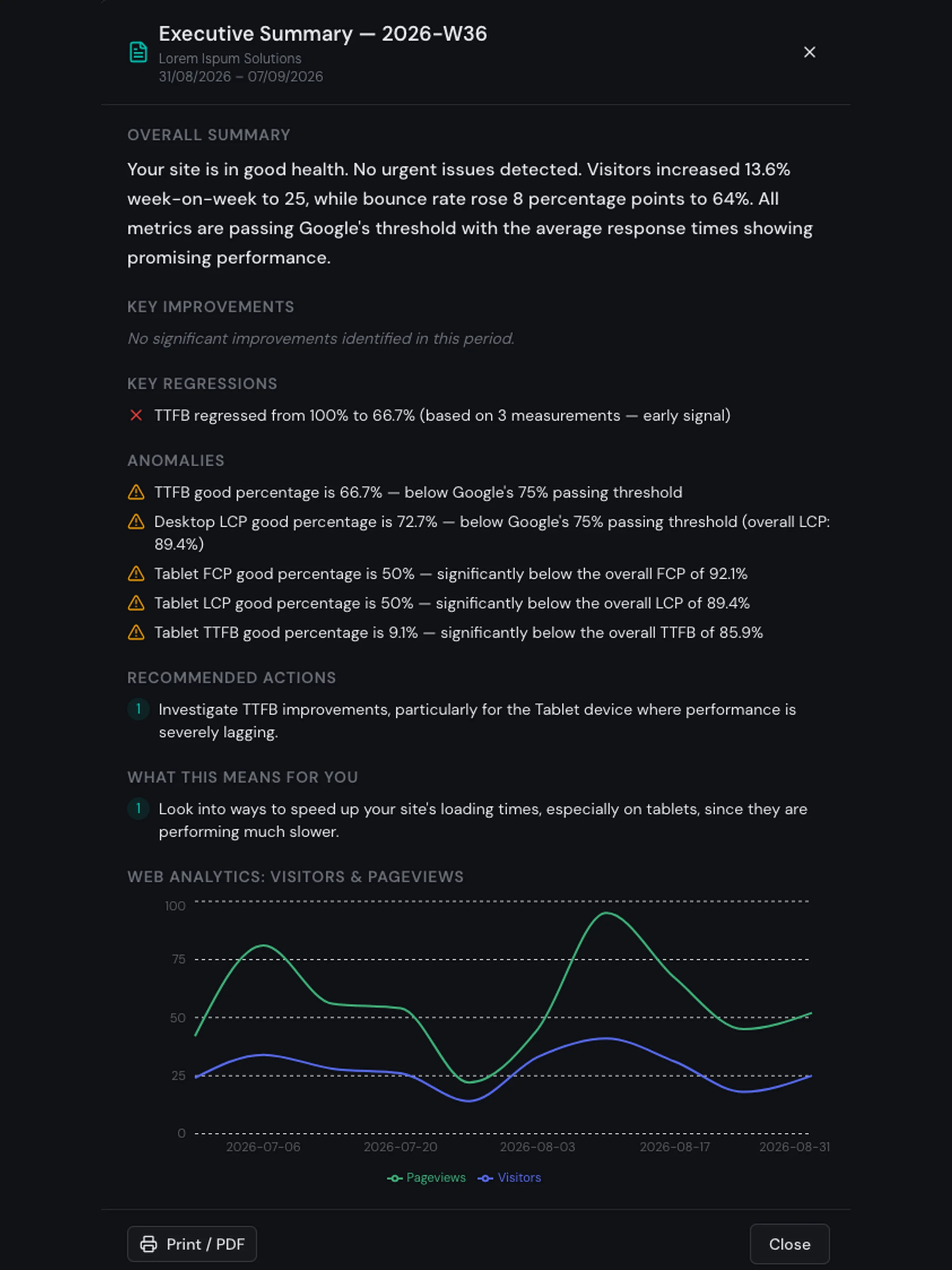
This is a real weekly report generated from live monitoring data. Your reports will look the same — tailored to your website and your visitors.
The report opens with an overall summary that tells you in a paragraph, whether your website is passing or failing Google's Core Web Vitals thresholds — and what that means for your visitors. It then lists what improved and what regressed week-on-week, so you can see at a glance whether your site is heading in the right direction.
If anything unusual is detected — such as a sudden spike in a specific metric or a page behaving very differently from the rest — it is flagged as an anomaly. Each anomaly includes why it matters and what to check.
Below the performance data, the report gives recommended actions: clear, prioritised suggestions written for developers and, separately, in plain English for non-technical stakeholders. Each action explains what to investigate, which page or issue it affects, and why fixing it matters for your business.
When traffic data is available, the bottom section of the report shows the last few weeks of visitors and pageviews at a quick glance — so you can spot trends in your audience alongside your performance metrics without switching tools.
The full dashboard is always available if you want to explore further, but the weekly report is designed so you never have to. Understand your website's health in one minute a week.